
Understanding these spacing principles is essential for any designer working with text, whether you’re creating logos, websites, print materials, or digital interfaces. Modern fonts generator tools have made it easier than ever to experiment with different typefaces, but knowing how to properly adjust their spacing is what transforms good typography into great typography.
This comprehensive guide will explore each spacing technique in detail, provide practical examples, and show you how to apply these principles in your design work. By the end, you’ll have the knowledge to create typography that not only looks professional but also enhances readability and user experience.
Understanding Typography Spacing Fundamentals
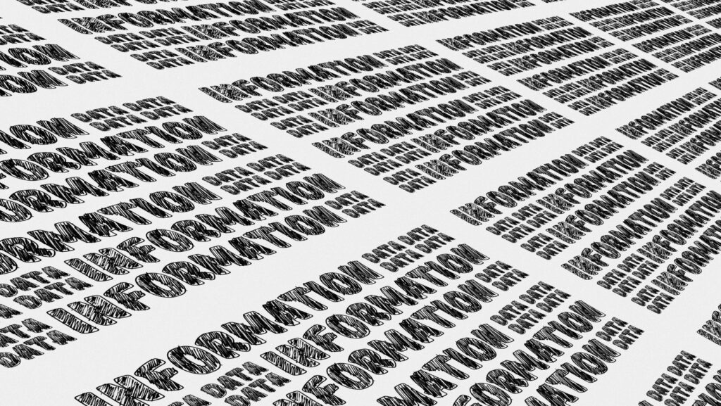
Typography spacing plays a crucial role in creating readable and visually appealing text. The three primary controls—kerning, tracking, and leading—address different aspects of text layout. Kerning adjusts the space between individual letter pairs, tracking modifies the spacing across entire words or blocks of text, and leading controls the vertical space between lines. These spacing decisions are essential for establishing hierarchy, readability, and the overall tone of the design.
As Lyndsey Drooby, a contributor to The Artistry on Creative Fabrica, eloquently explains, “Typography spacing is like the breathing room of design—it’s not just about making text fit, it’s about creating rhythm and flow that guides the reader’s eye naturally through your content. When spacing is done right, it becomes invisible to the reader, but when it’s wrong, it creates friction that can completely derail the communication.”
Professional designers understand that spacing adjustments are functional choices that affect how readers process information. Poor spacing can hinder readability or create visual tension, while well-adjusted spacing enhances the reading experience. Modern design software allows for precise control over these parameters, but effective use requires practice and an understanding of how to balance readability with the design’s aesthetic.
What is Kerning and Why It Matters
Kerning refers to the adjustment of space between specific pairs of letters to create visually consistent spacing throughout a word or line of text. Unlike tracking, which affects all letters equally, kerning targets problematic letter combinations that appear too close together or too far apart due to their individual shapes.
Certain letter combinations naturally create awkward spacing due to their geometric forms. Classic examples include “AV,” “WA,” “To,” and “Yo,” where the shapes of the letters create either excessive white space or cramped appearance. Professional typefaces include built-in kerning pairs that automatically adjust these combinations, but designers often need to make manual adjustments for optimal results.
The impact of proper kerning becomes most apparent in headlines, logos, and display text where letter spacing is more noticeable. Poor kerning can make words appear broken or create unintended visual emphasis on certain letters. In extreme cases, bad kerning can even change how words are read or create unintended meanings.
Mastering Tracking for Consistent Text Spacing
Tracking, or letter-spacing, refers to adjusting the uniform spacing between all letters in a word, line, or block of text. Unlike kerning, which adjusts specific letter pairs, tracking ensures consistent density throughout the text. Tight tracking is often used in headlines or logos for a modern, compact look, while loose tracking can enhance readability, create an elegant feel, or help fill space in layouts.
The ideal tracking depends on factors like typeface, text size, and usage. Sans-serif fonts often work well with tighter tracking, while serif fonts may need more space. Display text typically uses tighter tracking for impact, whereas body text benefits from standard or slightly loose tracking for readability. Tracking should also consider the design context, including the medium and viewing distance. Experienced designers develop a keen sense of appropriate tracking by studying well-designed typography.
The Science of Leading: Controlling Line Spacing
Leading, pronounced “ledding,” refers to the vertical space between lines of text, measured from baseline to baseline. Originally, metal strips of lead were used to increase line spacing, but today, leading is digitally controlled and plays a crucial role in readability. Proper leading ensures a smooth reading experience by preventing lines from interfering with each other. Too little leading makes text feel cramped, while too much creates disconnection and slows reading speed.
The ideal leading depends on factors like line length, font size, and the reading context. Longer lines of text often require more leading for easier tracking, while smaller text may need proportionally more space for readability. Professional typography typically uses leading that is 120-145% of the font size, though this varies depending on the typeface and application. Display text uses tighter leading for impact, while body text benefits from more generous spacing to prioritize readability. Understanding these dynamics helps designers create both aesthetically pleasing and functional text layouts.
How Font Generators Enhance Typography Workflow
Modern font generators have transformed typography workflows by providing easy access to a wide range of typefaces and customization options. These tools allow designers to quickly experiment with different fonts, weights, and styles, helping them find the perfect typeface for any project. Many font generators include built-in spacing controls, enabling real-time previews of how kerning, tracking, and leading adjustments impact the design.
Additionally, some font generators support variable fonts, offering continuous adjustments of weight, width, and other attributes, including more refined spacing controls. This flexibility is especially beneficial for responsive design, where text needs to adapt to different screen sizes. The integration of AI and machine learning has further improved automatic spacing suggestions, allowing even less experienced designers to achieve professional results while learning proper spacing techniques.
Common Typography Spacing Mistakes and Advanced Techniques
Even experienced designers can make common spacing mistakes that negatively impact their typography. Over-kerning, or making excessive adjustments, can create unnatural spacing, while applying the same tracking settings across different text sizes can lead to text that appears too tight or too loose when scaled. Inconsistent leading, which creates poor readability, and failing to adjust leading based on line length can also detract from the overall design. These issues can harm the reading experience and make the text feel unprofessional.
Professional typography involves more than basic spacing adjustments. Optical spacing, which adjusts spacing based on visual perception, and contextual spacing, which tailors the spacing for different text elements, help to establish hierarchy and improve design coherence. Additionally, understanding the emotional impact of spacing—such as how tight spacing can create urgency or generous spacing conveys calm—can reinforce the intended message. Typography pairing is another crucial aspect, ensuring that spacing between different typefaces maintains harmony and visual weight.
Modern design tools offer precise typography spacing control. Software like Adobe InDesign provides advanced features for kerning, tracking, and leading adjustments, while digital design platforms like Sketch and Figma cater to responsive typography. Specialized tools like FontLab and Glyphs allow for custom font creation and spacing modifications, while web-based font generators make professional typography accessible to a wider audience, often including educational features to guide users in proper spacing techniques.
Conclusion
Mastering kerning, tracking, and leading is crucial for creating professional, readable typography. These spacing elements work together to enhance both the aesthetics and functionality of text, helping to communicate your message clearly. Proper spacing improves readability, creates hierarchy, and aligns with the design goals of your project.
While modern tools make typography spacing more accessible, developing a trained eye for spacing remains essential for professional results. Typography should always serve the content and audience, with spacing choices that enhance readability and support the overall design. With practice and attention to detail, you can achieve typography that facilitates communication seamlessly.